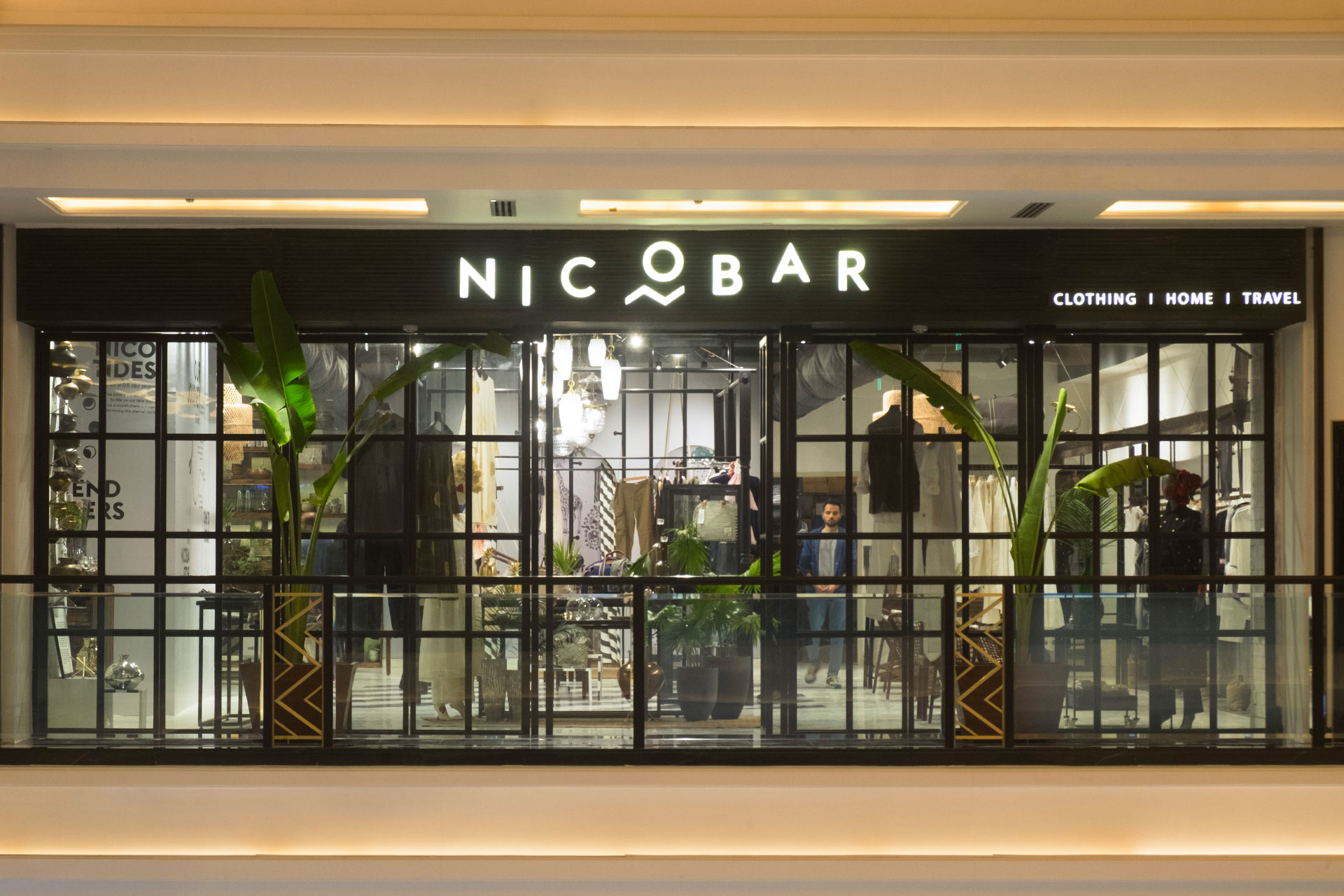
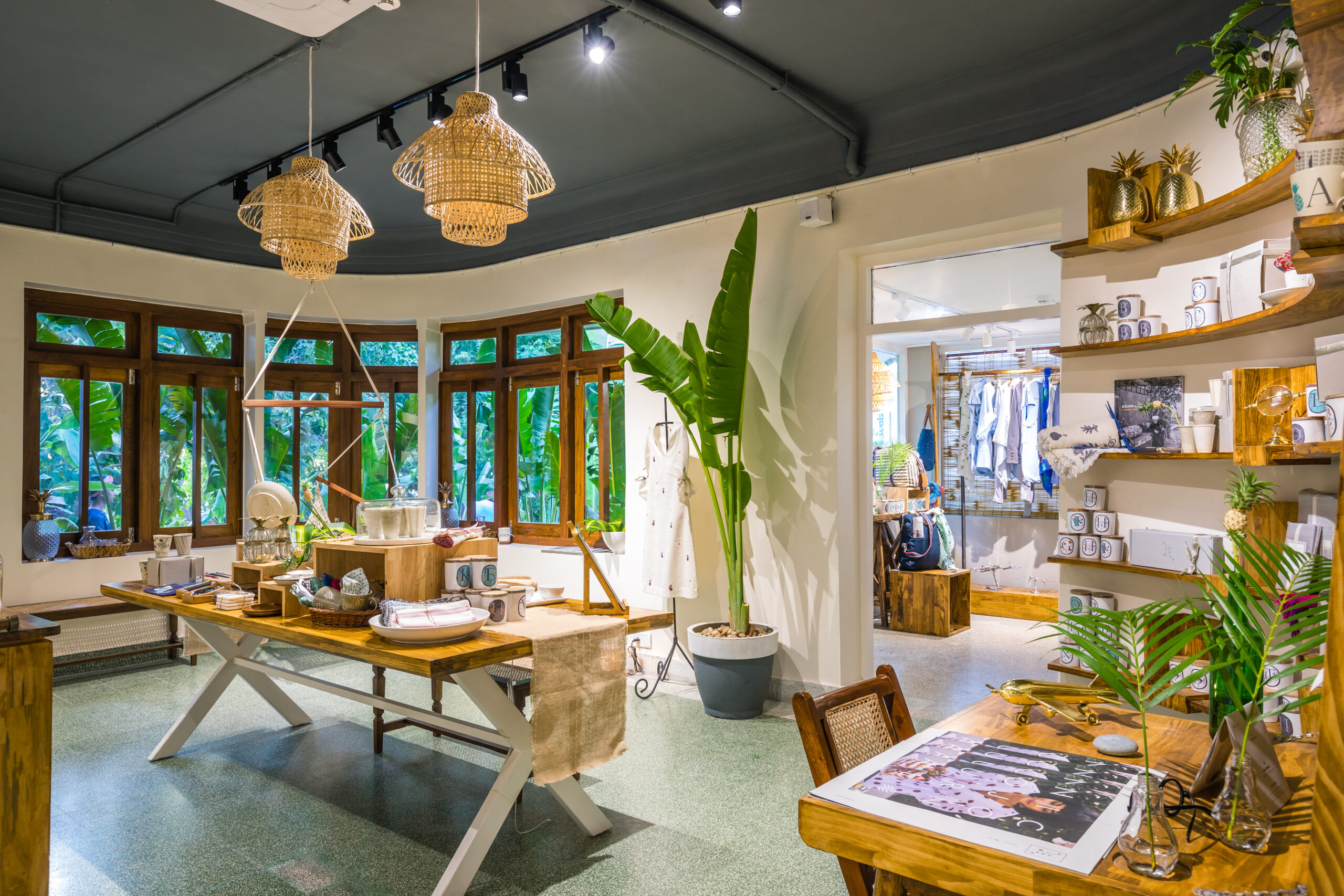
The Nicobar store at The Chanakya is conceived as a layered interior landscape—darker, quieter, and more inward-looking than the brand’s other locations. Here, LAB distils the tropical Indian design vocabulary into a grounded, textural expression shaped by material weight, shadow, and craft.
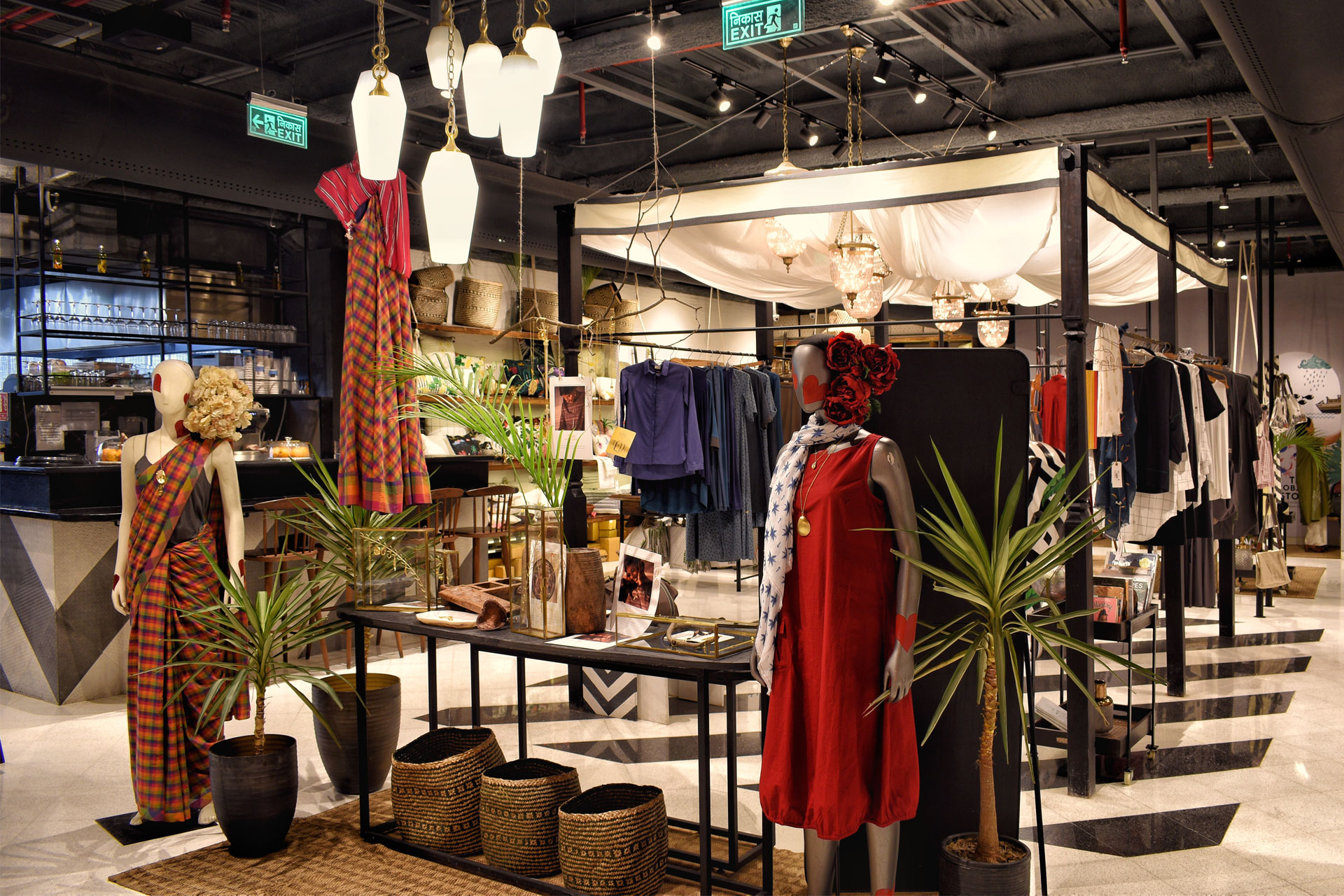
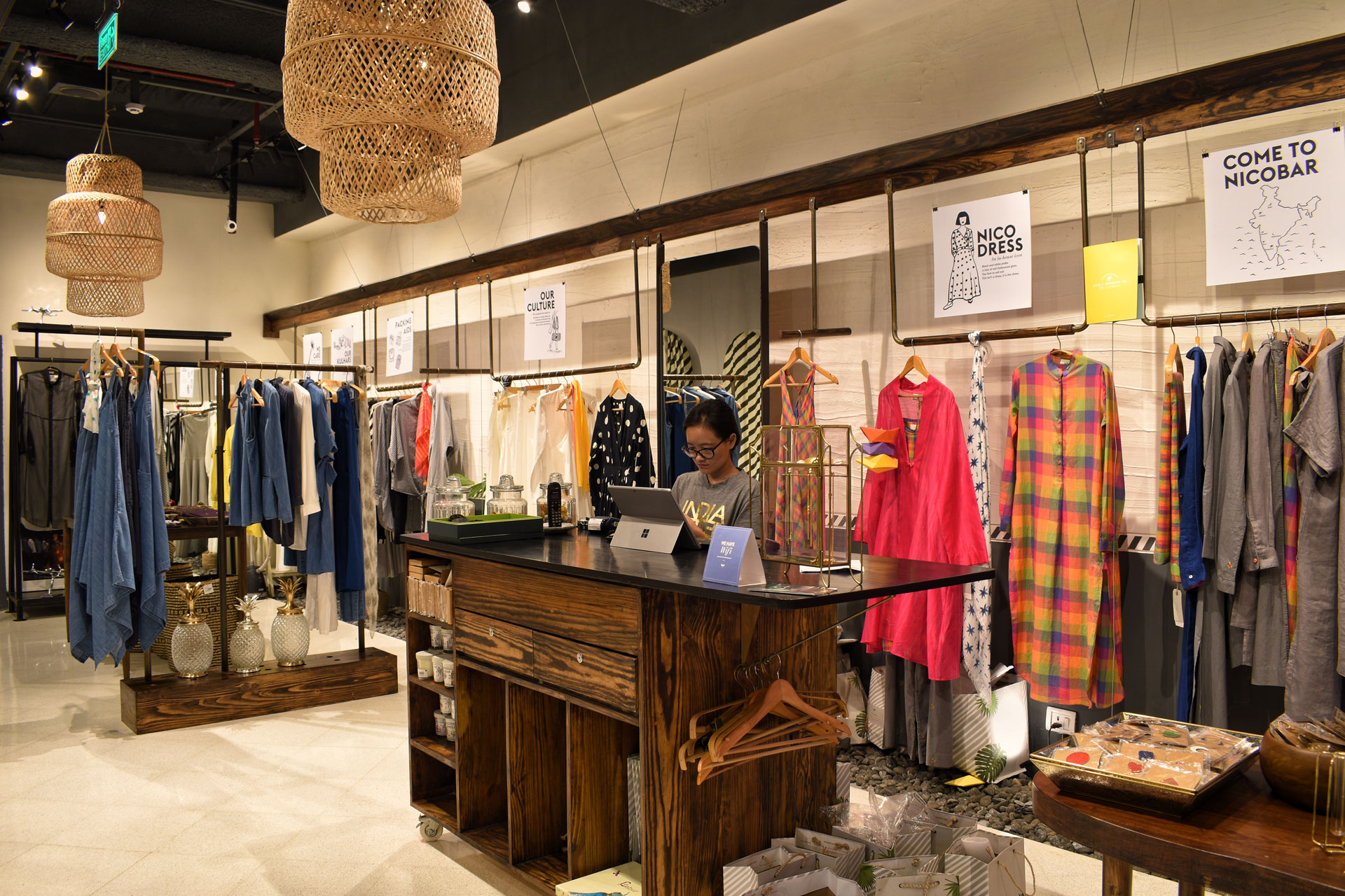
The store is organised into three distinct yet fluid sections—homeware, clothing, and travel—each articulated through shifts in material, scale, and atmosphere rather than overt separation. This allows the space to unfold gradually, encouraging exploration and pause rather than linear retail movement.
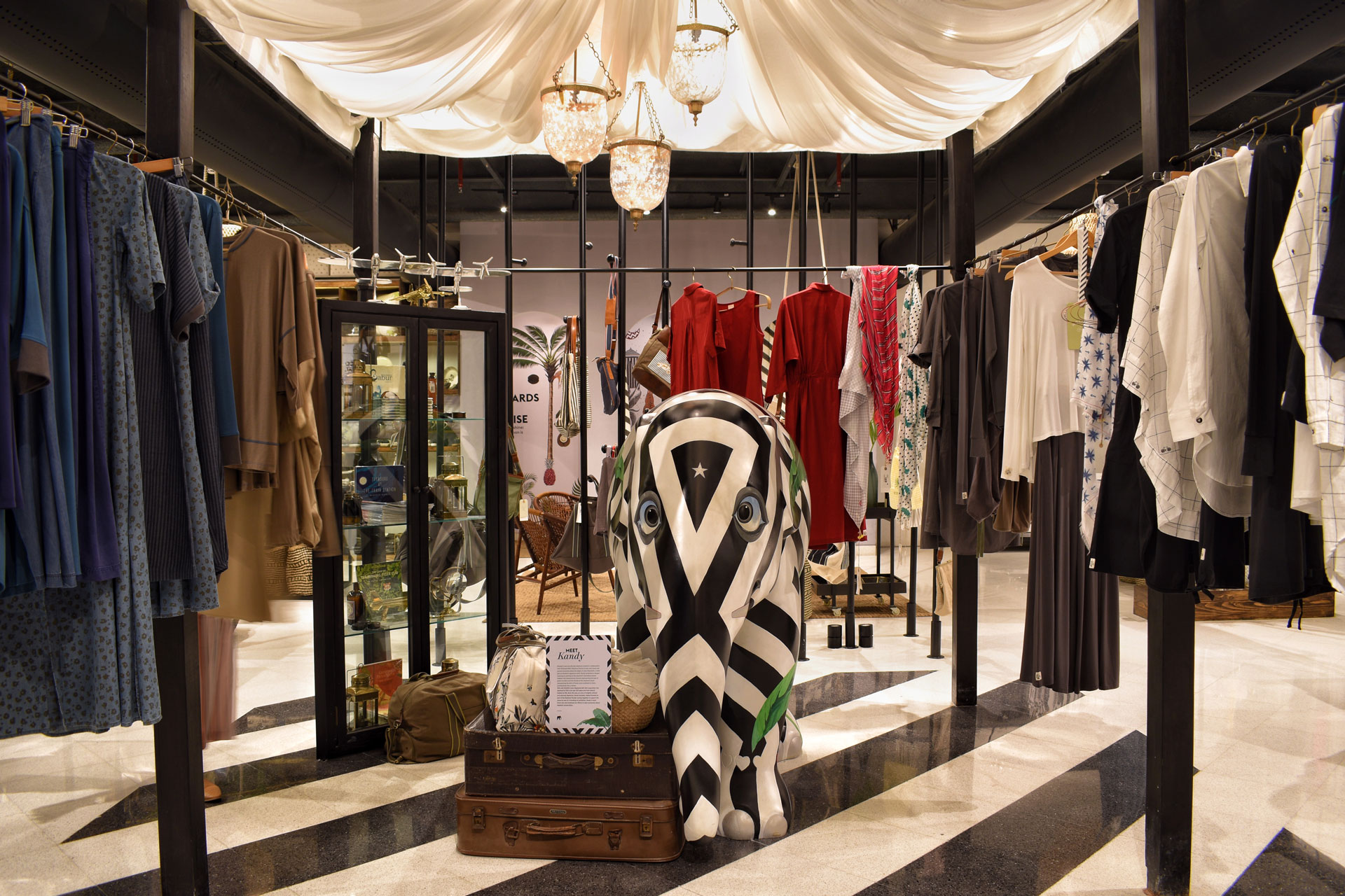
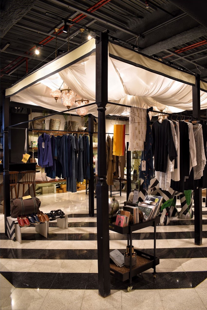
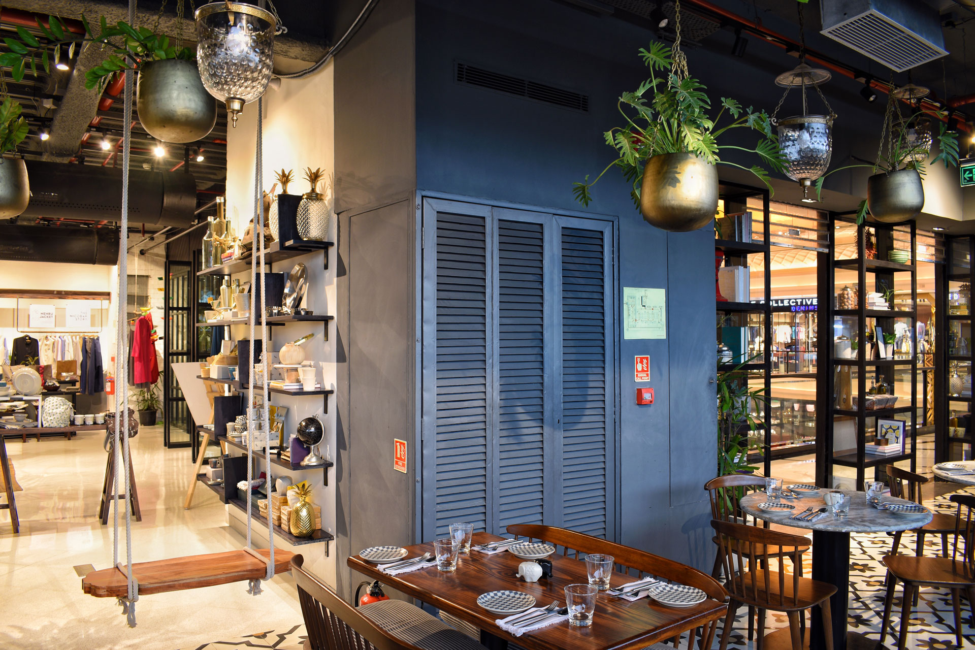
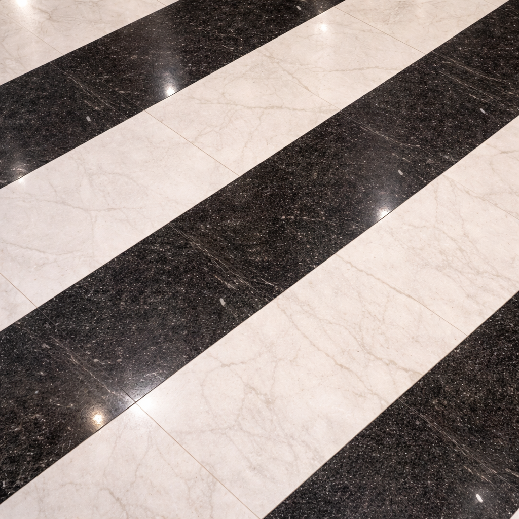
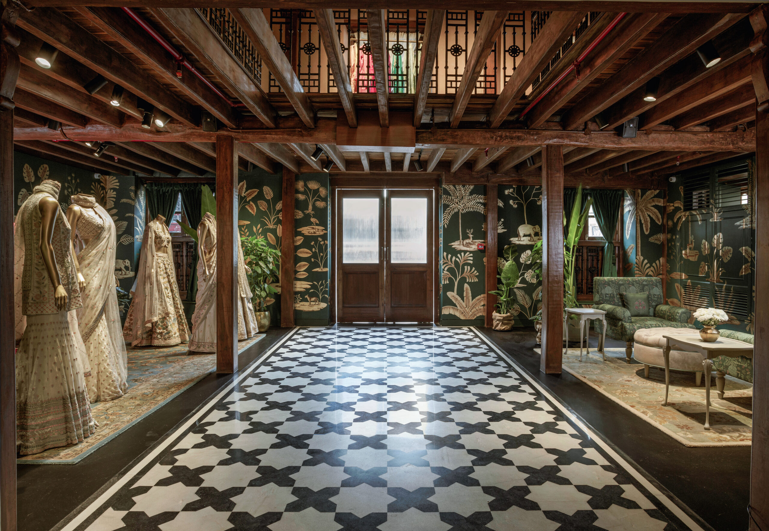
Black slate floors anchor the interiors, lending a sense of gravity and calm. Walls are finished in textured plaster, bearing subtle imperfections—whispers of the hand—that reinforce Nicobar’s commitment to the handmade. A series of traditional timber columns frames an implied courtyard at the heart of the store, around which the programme gently circulates.
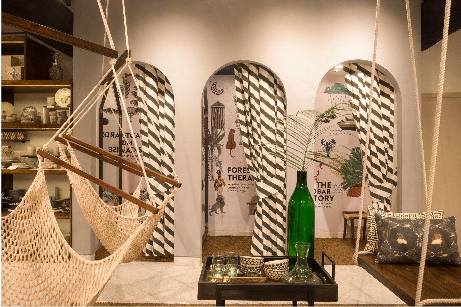
Within this central zone, a draped, striped fabric canopy introduces a striking yet informal gesture—part tent, part verandah—softening the architecture and evoking the ease of temporary, lived-in structures. The store reads less as a display environment and more as a place to inhabit.
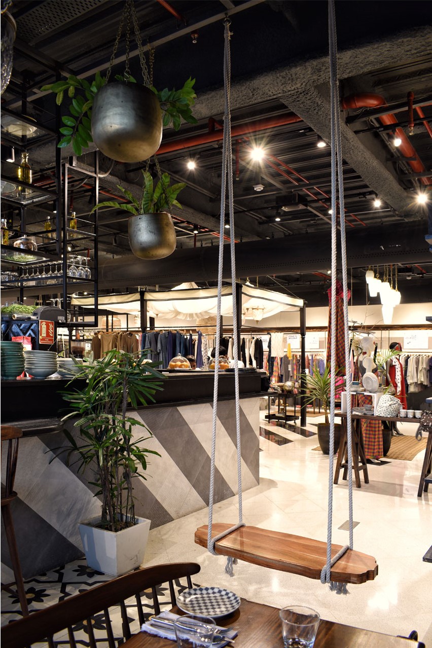
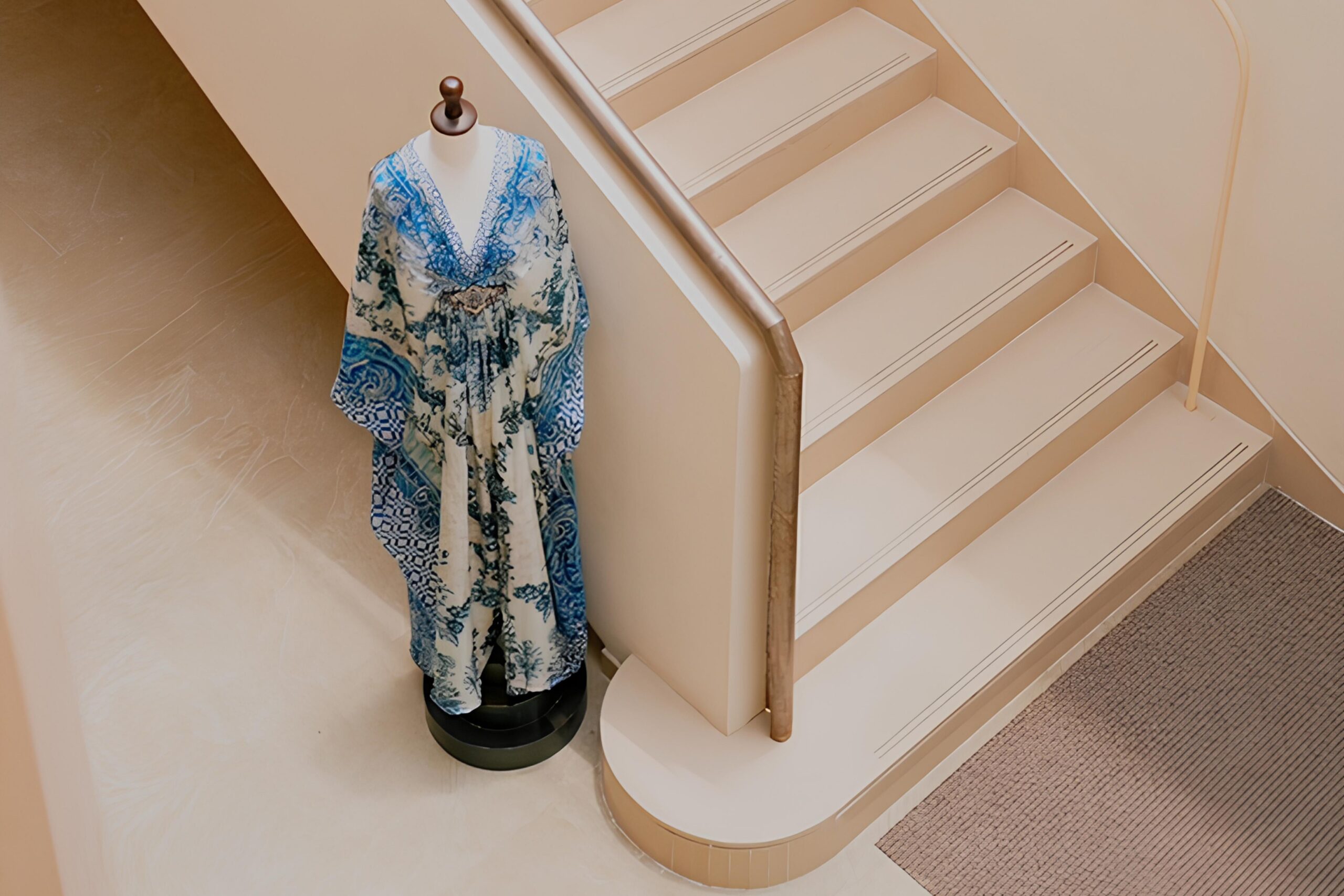
The trial room lounge is designed as a moment of rest rather than transition. Floating timber swings and rope swings allow for casual sway and movement, reinforcing Nicobar’s idea of clothing as something lived in, not merely tried on. These elements introduce lightness and comfort into the retail experience.
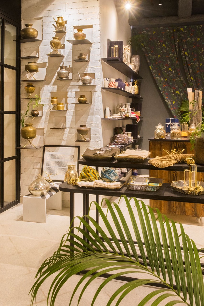
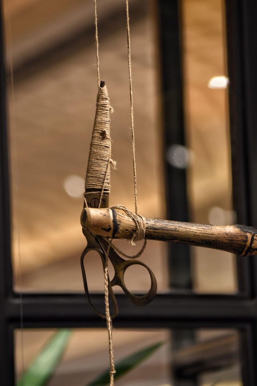
Signature installations are reinterpreted with restraint. The Lota Library appears as a quiet celebration of Indian ingenuity and everyday design intelligence. Slate display shelves rise seamlessly from the floor, while suspended clothing racks float above beds of pebbles, held delicately by rope—lightness counterbalanced by material weight.
The store is directly connected to Caara Café, extending the Nicobar experience beyond retail into hospitality. Conceived as an ingredient-forward café, Caara carries forward the same tropical Indian sensibility through handcrafted ceramics with regional motifs, a garden-like atmosphere, and a relaxed spatial rhythm. Suspended brass planters, cane and rattan lighting, and layered greenery soften the interiors, while an open bar and counter-style restaurant encourage informal gathering and lingering.
Together, the store and café form a continuous environment—retail, pause, and nourishment interwoven. Materials such as slate, timber, rope, brass, cane, rattan, pebble, and fabric are left honest and expressive, allowing craft and making to remain visible.
At The Chanakya, Nicobar becomes more than a store. It is a place to slow down—where shopping, reading, conversation, and dining coexist within a spatial language that is vernacular in spirit, contemporary in expression, and quietly confident in its presence.